Stitch-It & Co Branding and Site Replatform and Redesign
Stitch-It & Co. is an established entity in Nashville. Historically the go-to tailors and seamstresses for Nashville, Stitch-It was branching out into the custom menswear market. Their site’s CMS, content, copy, and design was dictated by an agency affiliated with the owner.
To elevate their new offering and let others know about the new product from a beloved brand, Stitch-It needed a redesign of their site, including new content, CMS, branding, and established lead flow.
Challenge
The brand has been around for 30 years, and the owner was fairly traditional in his approach to branding—especially since the clientele have classic tastes.
The site was full of older, low-res images, and outdated copy. There was no strong sense of branding, and any stock photos lacked cohesion.
Speaking of branding, there were also dueling brands. The owner wanted to roll out his custom suit line under his surname, “Loring & Co. Custom.” This was not only confusing to me, but would be to the customer as well. We needed to address the separate brands and either entirely separate them or realign them.
The final aspect of this challenge was the lack of direction from owner. He had thoughts on assets and copy once he saw them, but his overall direction during pre-production was just to make it better.
It was my job to learn about his business, assess the needs of the site, and create these assets with little to no direction.
Process
The first step was to look at the current site flow and wireframe the pages that needed to be transferred.
Sitemap
Here are some pages from the old site:


After taking in the current site flow, I considered two things as I approached a new sitemap:
More content was needed for this site to gain authority and traffic with SERPs. This would also help prospective customers understand offerings better, and therefore be more likely to convert.
Pages needed solid categorization to make the site logical to navigate.
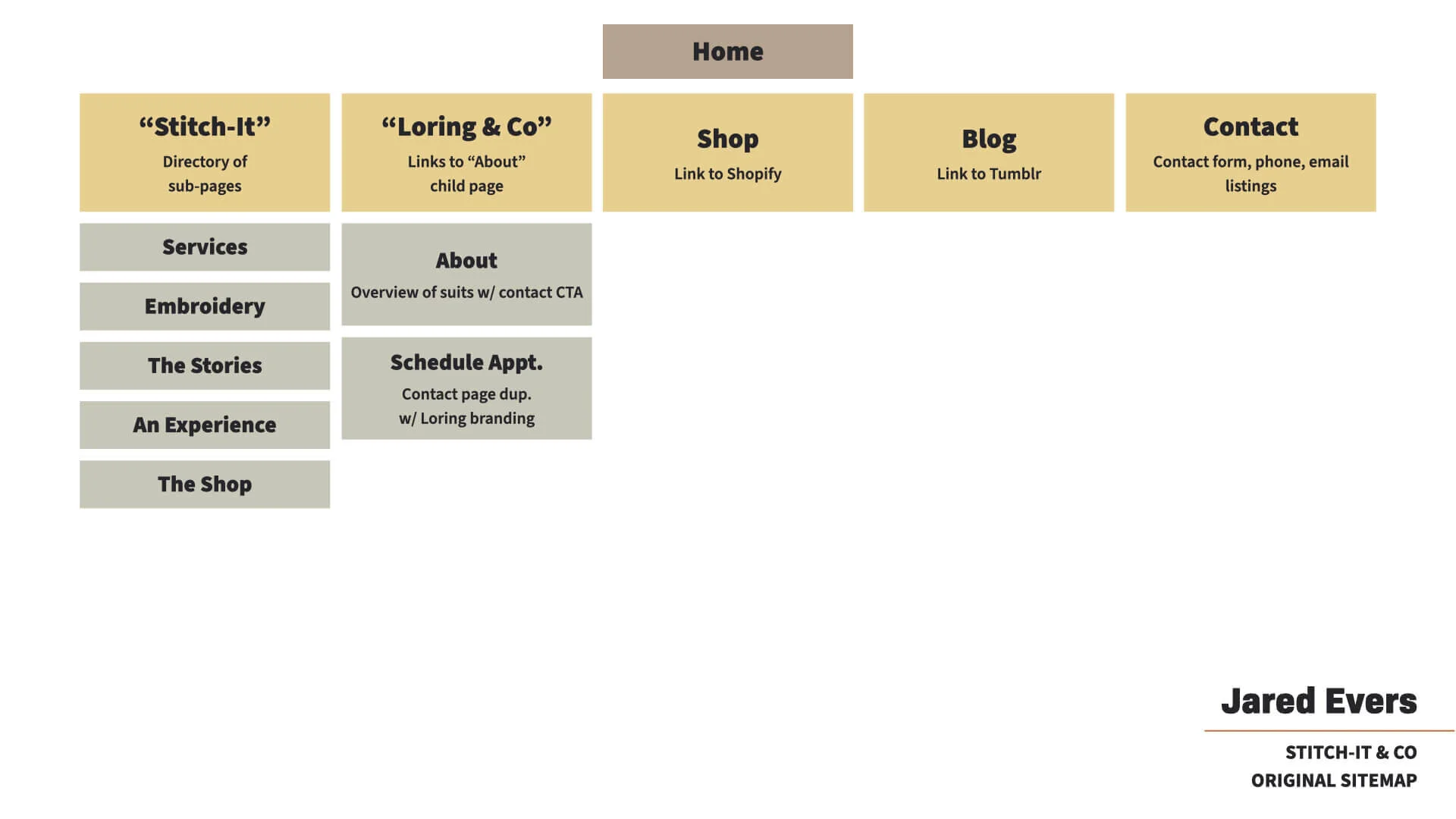
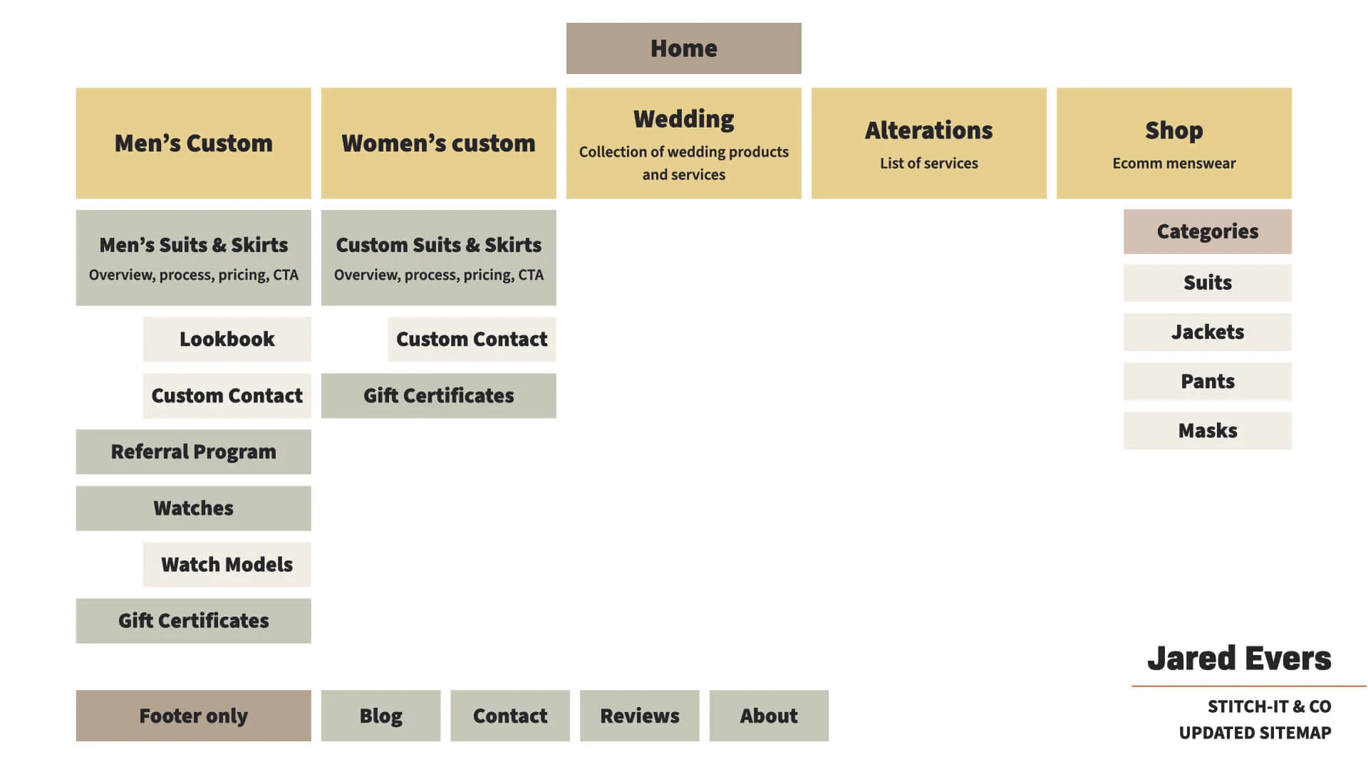
Take a look at the original sitemap versus my take below. (Note: Not all pages are shown in this sitemap, there are many pages that aren’t nested.)
Lead flow
With the e-commerce products, there were two calls to action that I needed to balance: one is to shop online, and the other is to contact a tailor to begin creating a custom suit.
To accommodate this, I created a few opportunities based on the part of the site.
Home: People that find Stitch-It organically would likely be interested in browsing first, so I placed multiple CTAs to shop and only one to contact a tailor.
Men’s Custom page: If a user navigated to this page before or after shopping, they were likely interested in a more specific product. On this page, I set “contact” to be the primary CTA. The secondary on this page is to see the Lookbook, which is another way to browse and see the products Stitch-It could accommodate.
Men’s Custom / Lookbook: I designed the lookbook to follow specific characters (our models) and to weave in the story of how their lives were accentuated by their custom pieces. The CTAs here were all to contact a tailor, with links out to custom contact pages based on the page they’re on (to track conversions from specific content).
Men’s Custom / Watches: Since these watches weren’t available to buy online, the CTAs on all these subpages (Watches main page as well as individual product pages) were to contact Stitch-It to purchase or learn more.
Women’s Custom: This page is laid out identically to the Men’s Custom page.
Alterations: This had one CTA to contact a tailor, as this page was primarily aimed at answering the question, “What services do you offer? What garments do you alter?”
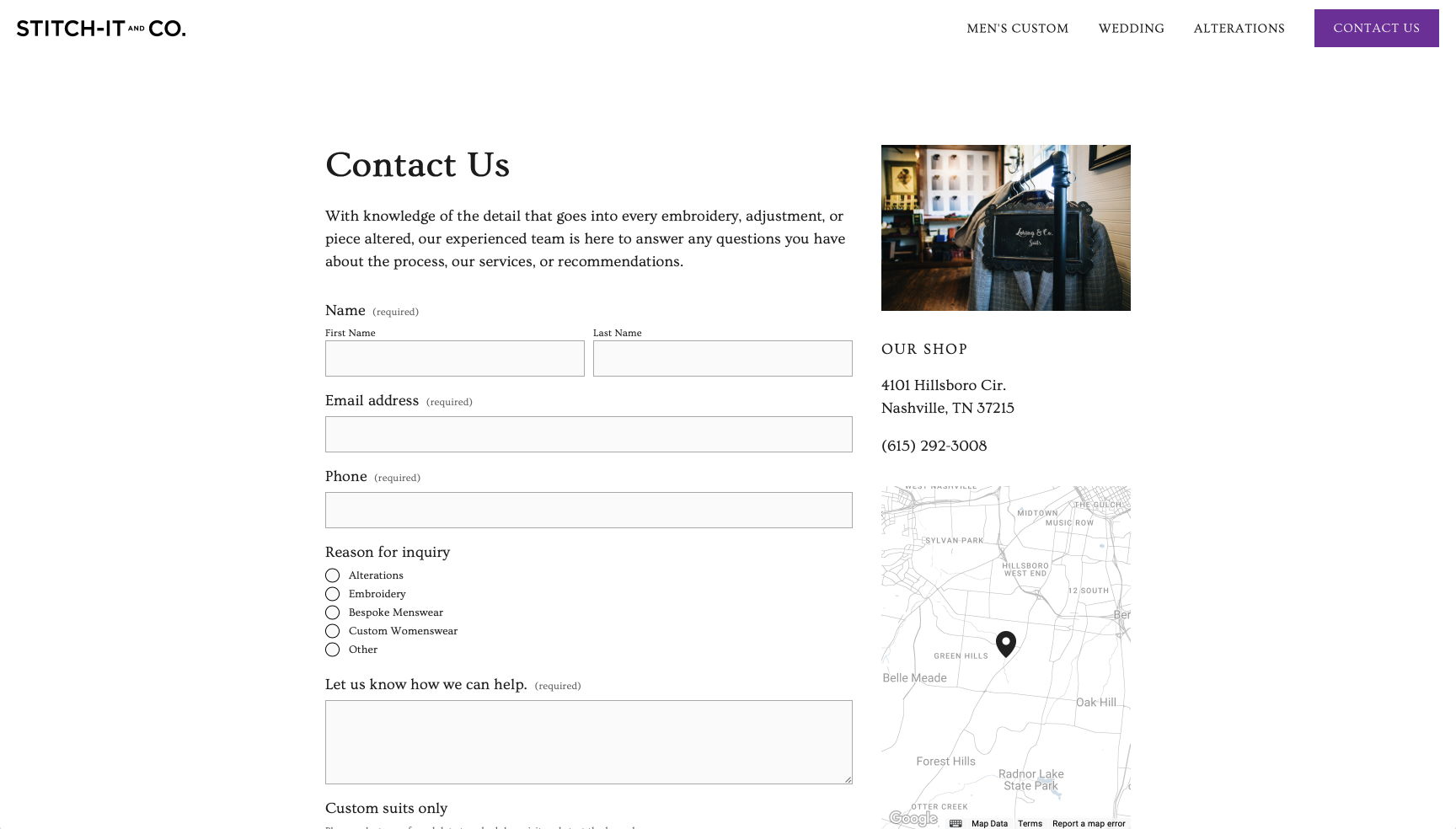
For the contact page itself, I constructed this to accommodate a handful of technicalities:
I created multiple contact pages to adjust the contextual headers and bodies. There are contact pages for: general questions, custom suit, custom suit model #1, custom suit model #2, and watch purchases.
The forms connected to the shop’s email, a Google sheet, and Mailchimp, so the contact could not only be tracked by email and a spreadsheet, but they could also opt into mailings.
CMS construction
I switched Stitch-It from an entirely custom site—one with which they didn’t have access to a backend CMS—to a Squarespace site, since I’m a Circle Member and have the most experience in this CMS.
The process took about one month to set up new pages, edit existing copy, and write new copy. I also adjusted the CSS for a few items, like the footer newsletter signup, since that form wasn’t very accessible.
Creative assets
One thing that didn’t come up in the original scope was the need for updated photography and logos.
Logo work
First, I aimed to tackle the logo. It was a little stale, and needed to be rebuilt anyways because the resolution of the file I had was too low, and I didn’t have access to the editable file.
We needed to keep to it timeless and classic, since that was a major part of the brand and resonated with the clientele.
I took the simple word mark and added a stitching around the title, while also updating the font to Ovo, a modern take on a classic font.
Note: Since the site relaunch, the logo has been changed by an outside agency. But it’s worth noting that the founder actually prefers this logo.
Photography work
To get the photo assets I needed, I need to run two shoots: one to portray the look and feel of the shop, and one for the lookbook and social assets.
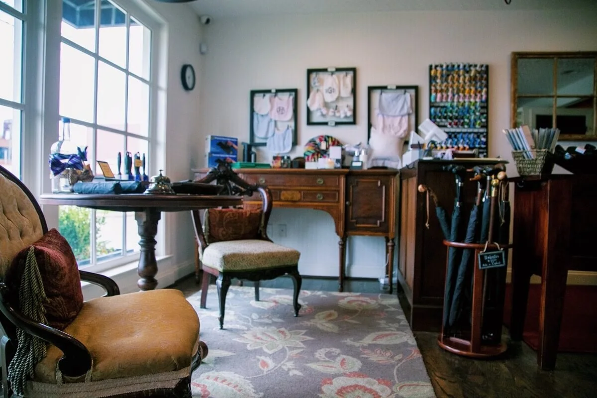
First, I went to the shop and staged some photos to give the website texture. I used a 5D to shoot and edited the photos using VSCO treatments.


New website
They ultimately went another direction with the logo (a bolder choice), but we redesigned the website with warm, elegant photography and typography. We ended up designing on Squarespace so that Stitch-It could maintain the site and make edits as they desired.
Here are some stills of the new pages.
Redesigned Home
Redesigned Menswear and Custom Suit page
Redesigned Alterations and Services page
Redesigned Contact page


